Maximizing Sign-ups: Driving Growth in Renters Insurance Conversion
My work on the renters insurance website redesign transformed the user experience by streamlining workflows and simplifying the purchase process, resulting in a seamless journey that drives higher conversions and enhances customer satisfaction.
Sector
Renters Insurance
Results
$2M ARR growth after redesign
My Role
• Lead Designer • Research Support • Design System Contributor
Competing Through Clarity: How Better Design Generated $2M in Revenue
The Challenge: David vs. Insurance Goliaths
"I just want to protect my stuff without spending all day figuring out how..."
This was the frustrated voice of renters trying to navigate our insurance website. While industry giants dominated with massive marketing budgets, we had an opportunity to compete where it mattered most – the actual user experience. Our clunky, outdated interface was driving potential customers away, and with every abandonment, we were losing ground to bigger competitors.
Why This Project Mattered
In the renters insurance market, trust is everything. Our research showed that users didn't necessarily want the biggest name – they wanted the easiest path to peace of mind. We had competitive rates and solid coverage, but our complex interface was standing in the way of success.
Key Challenges:
- High abandonment rates during quote process
- Complex checkout flow driving users to competitors
- Lack of clarity around coverage options
- Difficulty competing with larger insurers' brand recognition
Discovery: Understanding the Real Insurance Journey
Deep-Dive Research
Instead of just analyzing drop-off points, we:
- Conducted side-by-side comparisons with major insurance sites
- Shadowed customer service calls to understand pain points
- Analyzed abandoned cart data for patterns
- Interviewed users about their insurance shopping process
Key Insights
1. Speed Beats Brand
- Users would choose a lesser-known provider if the process was faster
- The first 60 seconds of the experience were crucial
- Quick quotes were more important than comprehensive features
2. Clarity Creates Trust
- Clear pricing built more confidence than industry logos
- Users wanted to understand coverage without insurance jargon
- Transparency about coverage limits reduced anxiety
3. Simplicity Sells
- Users abandoned complex forms for simpler alternatives
- Most users wanted basic coverage without upsells
- Mobile users particularly valued streamlined experiences
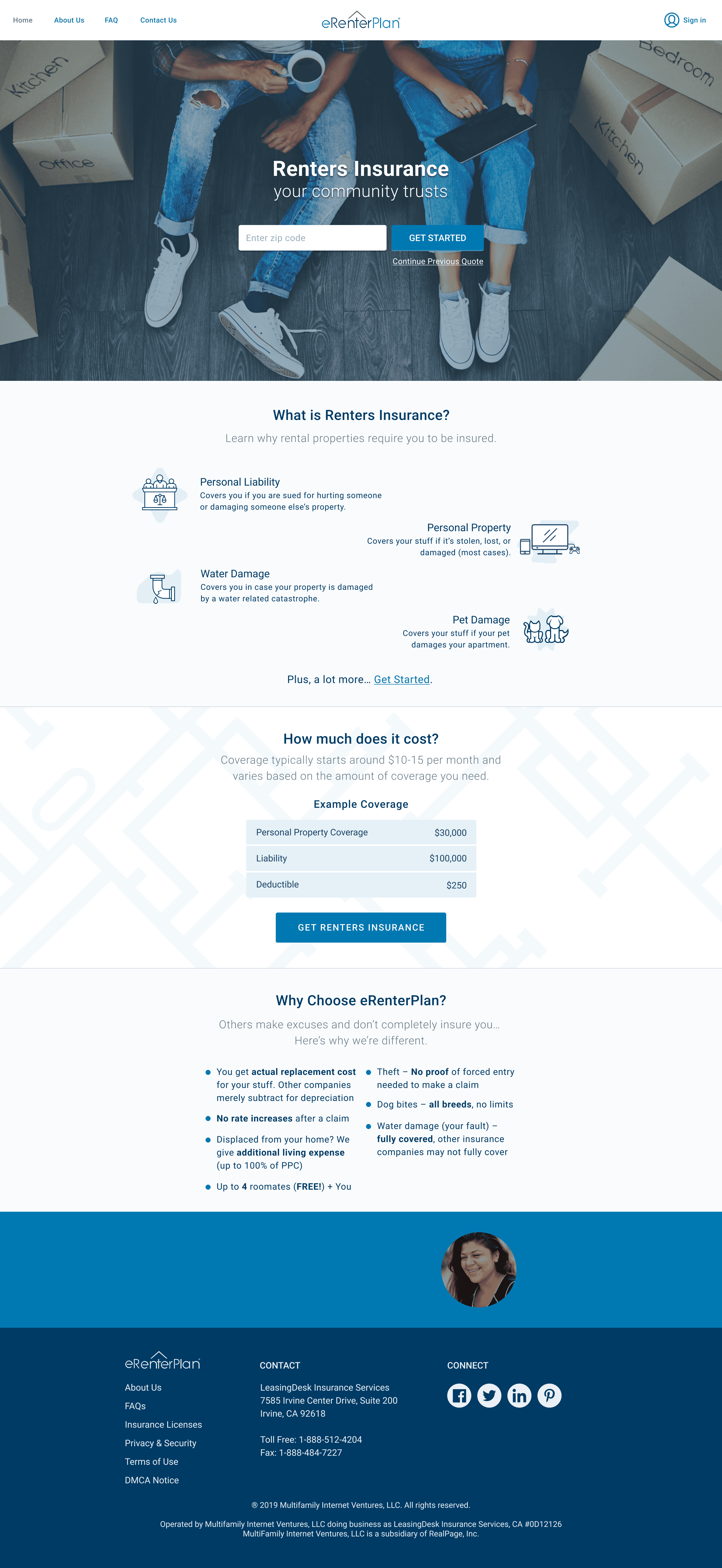
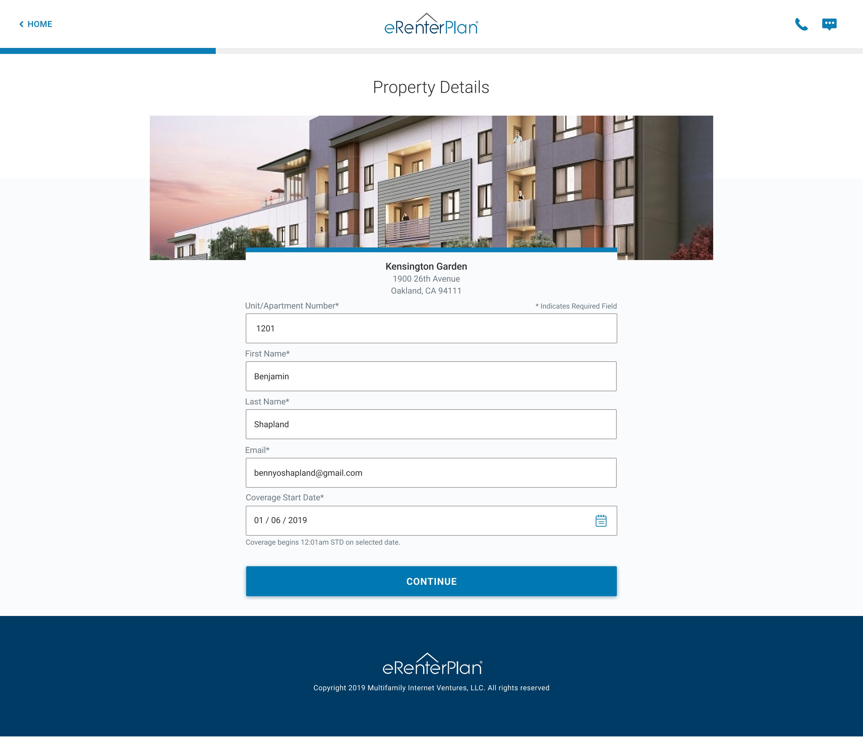
The Solution: Competing Through Clarity
We developed a design strategy focused on making insurance shopping feel less like a chore and more like a quick, confident decision.
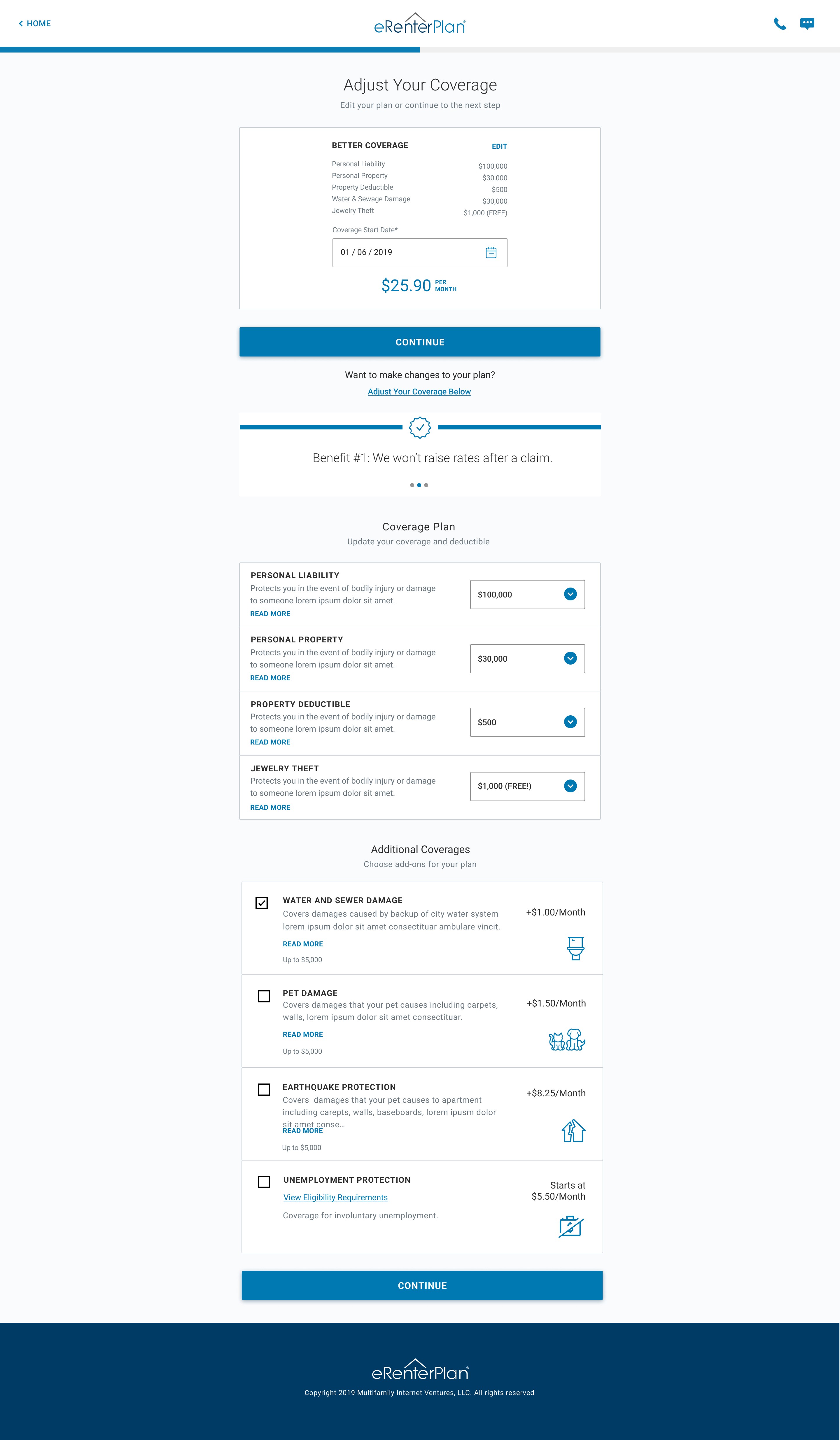
1. Streamlined Quote Flow
- Reduced required fields from 15 to 7
- Added smart defaults based on location data
- Created persistent price preview
- Implemented auto-save functionality
2. Trust Through Transparency
- Plain-language policy explanations
- Real-time coverage customization
- Clear comparison tools
- Upfront pricing without hidden fees
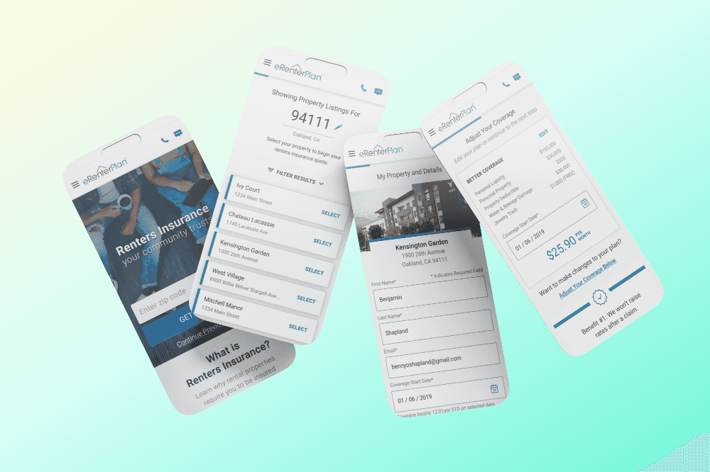
3. Mobile-First Experience
- One-thumb friendly navigation
- Progressive disclosure of complex options
- Quick-resume capability
- Simplified mobile forms
The Design Process: Iteration for Impact
As the lead designer, I:
- Ran rapid design sprints with stakeholders
- Built and tested multiple prototypes
- Created a scalable design system
- Facilitated cross-team collaboration
- Conducted user testing sessions
My Approach
1. Research & Discovery (2 weeks)
- Competitive analysis
- User interviews
- Data analysis
- Stakeholder workshops
2. Design & Iteration (3 weeks)
- Design sprints
- Prototype testing
- User feedback sessions
- Design system development
3. Implementation & Testing (3 weeks)
- Engineering collaboration
- QA testing
- Performance optimization
- Launch preparation
The Results: Numbers That Tell a Story
The redesign exceeded expectations:
- $2M increase in annual recurring revenue
- 31% reduction in form abandonment
- 67% increase in mobile conversions
- 89% of users reported feeling "very confident" in their purchase
Key Learnings & Future Opportunities
What Worked Well
1. Mobile-first approach captured growing market
2. Clear, jargon-free language built trust
3. Rapid prototyping caught issues early
What I Could Improve
1. Earlier collaboration with compliance team
2. More extensive A/B testing
3. Better analytics implementation
Looking Forward
This project proved that in insurance, big budgets don't always beat smart design. By focusing on clarity, speed, and user confidence, we created an experience that could compete with industry giants. The success of this redesign showed that when it comes to insurance, users care more about getting it done right than getting it done with a big brand.
Today, our platform isn't just selling insurance – it's giving renters the confidence to protect their homes without the traditional hassles of insurance shopping.


MORE PROJECTS